How to Customize Android Like a Pro in 2026: The Ultimate Guide
Phone design took an exciting turn recently. Apple’s iOS 26 introduced the “liquid glass” aesthetic — translucent, frosted interface elements that seem to float above the wallpaper — and Android users immediately wanted the same look. The best part? You don’t need to wait for your manufacturer to catch up, and you definitely don’t need to switch to an iPhone. With a handful of free apps, you can learn how to customize Android like a pro in 2026 and build a home screen that looks straight out of a design showcase.
This guide walks you through the exact recipe: glass-style widgets, a matching icon pack, the perfect wallpaper, and a layout that ties everything together. No root access, no complicated mods — just smart choices and a little patience.
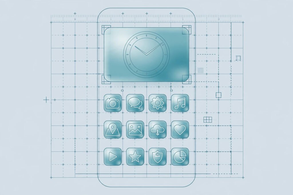
What Does a Pro-Level Setup Look Like?
Before changing anything, picture the target. A polished 2026 setup has four ingredients working in harmony:
- A cohesive wallpaper — a soft gradient or abstract background that lets translucent elements shine instead of fighting them.
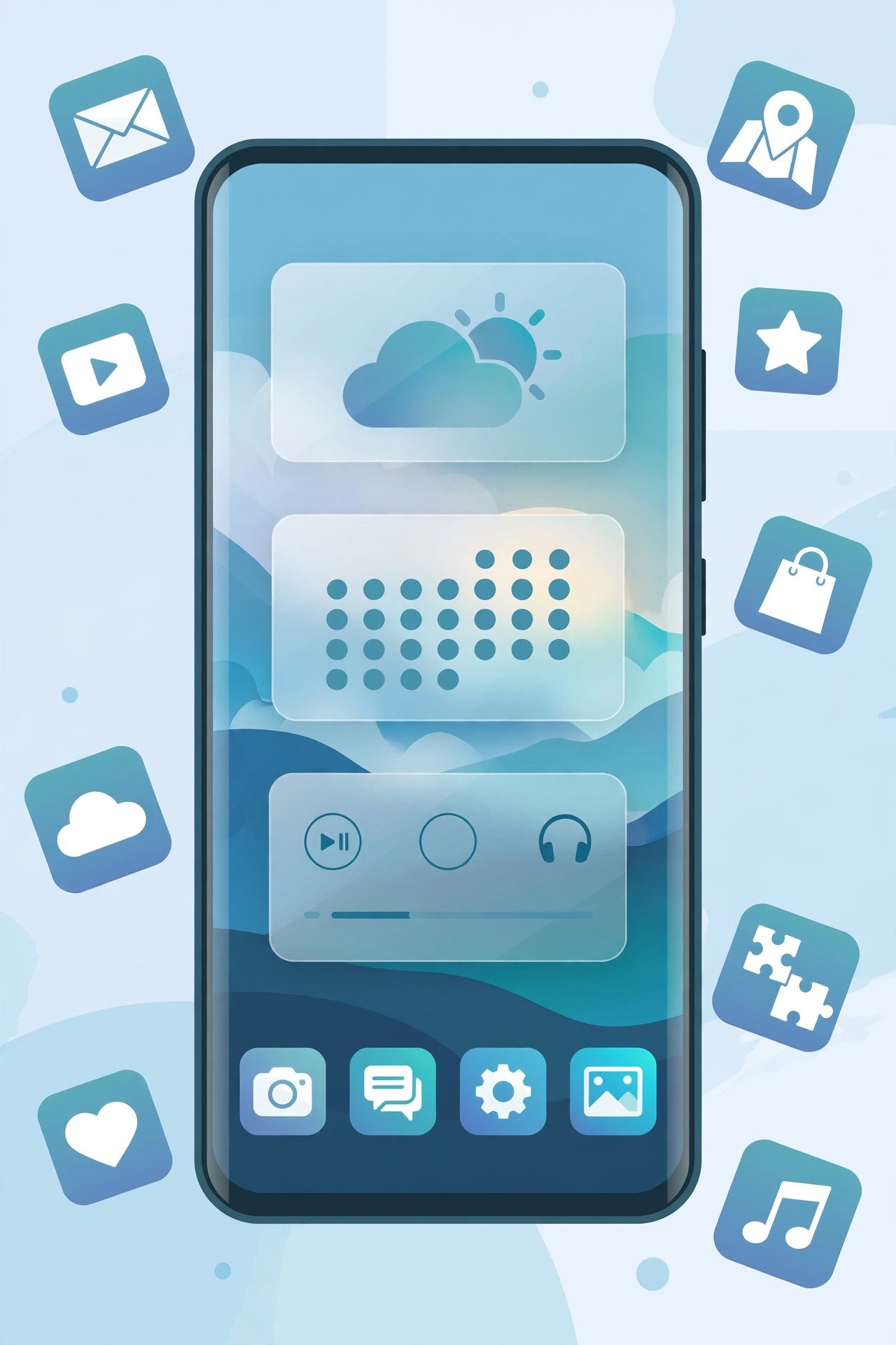
- Glass widgets — a search bar with an AI shortcut, a bold clock, a weather card, music controls, and quick settings toggles, all finished in frosted glass.
- A matching icon pack — icons with soft gradients and transparency that look like they hover just above the wallpaper.
- A tidy layout — a five-app dock and shortcuts placed within comfortable thumb’s reach.
Crucially, every element here earns its place functionally. The widgets actually do things: tap the music widget to skip tracks, tap a toggle to flip between silent and ring mode. That combination of beauty and utility is what separates a pro setup from a random collection of themes.
Step 1: Add Glass-Style Widgets
Widgets are the foundation of the liquid-glass look. Instead of wrestling with complex DIY widget builders, grab a dedicated glass-widget app — search your app store for “glass widgets” and you’ll find popular options offering hundreds of ready-made frosted widgets.
How to add them:
- Long-press an empty spot on your home screen and tap “Widgets.”
- Find your widget app in the list and browse the collection: clocks, calendars, weather cards, music controls, search bars, and device toggles.
- Tap a widget to place it, then drag the resize handles until it sits comfortably.
- Open the widget app’s settings to adjust transparency and corner radius — matching these to your wallpaper is what creates the seamless floating effect.
Pro tip: Start with three widgets at most: a clock, a search bar, and one utility such as weather or music. The classic beginner mistake is covering the entire screen. Restraint is what makes a setup look premium rather than cluttered. For a full phone makeover, pair this look with a matching iPhone-style call screen theme so incoming calls fit the aesthetic too.
Step 2: Apply a Matching Icon Pack
Icons make or break the entire aesthetic. A glass-style icon pack gives every app icon soft gradients and a translucent finish, so each one appears to float above your wallpaper. The best packs include thousands of themed icons plus “icon masking” — a feature that automatically styles even unsupported apps with a matching background, so nothing looks out of place.
How to apply an icon pack:
- On Samsung (One UI), Xiaomi (HyperOS/MIUI), OnePlus (OxygenOS), and most other Android skins: long-press the home screen, open Themes or “Wallpaper & style,” go to Icons, and select your pack.
- If your phone doesn’t support icon packs natively, install a custom launcher first, then apply the pack from the launcher’s own settings.
Choose a pack that ships both light and dark variants so your icons look right on any wallpaper. And commit to one accent color family — mixing neon-green icons with pastel-pink widgets is the fastest way to wreck an otherwise beautiful setup.
Step 3: Choose the Perfect Wallpaper
Even the finest widgets and icons fall flat on the wrong background. For the liquid-glass style, you want wallpapers with soft gradients, gentle blur, or abstract light effects. Busy photographs fight with translucent widgets for attention, and the widgets always lose.
Curated wallpaper apps — the kind focused on minimal and abstract collections rather than dumping thousands of random images — are ideal here. The good ones include built-in editing tools: soften the image with blur, adjust brightness and contrast, or shift the hue so the tones match your icon pack. A wallpaper dimmed just enough to make white glass widgets pop looks instantly cinematic.
Browse categories like abstract, gradient, aurora, or minimal, and preview each candidate with your widgets visible. The right wallpaper should feel designed for your setup: balanced tones, no harsh bright spots, and colors that echo your chosen accent.
Step 4: Arrange Your Layout Like a Designer
With all the ingredients ready, it’s time to compose the screen:
- The dock: Keep five essential apps in the dock — phone, messages, browser, camera, and one personal favorite. Five is the sweet spot between useful and crowded.
- The thumb zone: Place your most-tapped shortcuts and widgets in the lower two-thirds of the screen, where your thumb naturally rests.
- Breathing room: Leave at least one full row empty. Negative space is the secret ingredient that makes premium designs feel premium.
- One accent color: If your clock widget uses a warm amber accent, echo that amber in one folder or widget — not in everything. Repetition with restraint.
Take a screenshot, ignore it for an hour, then look again with fresh eyes and remove one thing. Editing is the step most guides skip, and it’s what separates good setups from great ones.
Do You Need a Custom Launcher?
Not necessarily. Here’s an honest comparison of the two paths:
| Approach | Pros | Cons |
|---|---|---|
| Built-in theming (One UI, OxygenOS, etc.) | Stable, no extra app, battery-friendly | Fewer grid and gesture options |
| Custom launcher | Total control over grid, icons, and animations | Small learning curve |
If your phone’s built-in options already cover widgets, icon packs, and wallpapers, stay stock — it’s the most reliable route and you can’t break anything. Reach for a launcher only when you want pixel-level control over grid size, icon scaling, or swipe gestures.
Pro Tips for a Cohesive Look
- Match your always-on display to the same wallpaper tones so the transition from lock screen to home screen feels seamless.
- Lean into dark mode at night — the frosted-glass effect looks absolutely stunning over dark gradients.
- Refresh seasonally. Swap the wallpaper and accent color every few months; it’s the cheapest “new phone” feeling available.
- Back up your layout if your launcher supports it, so a factory reset doesn’t erase an hour of careful design work.
- Keep widgets interactive. A widget you never tap is just decoration — replace it with something genuinely useful.
- Mind the notification shade. A matching quick-settings theme completes the illusion that the whole OS was designed this way.
Frequently Asked Questions
Do I need to root my phone for any of this?
No. Everything in this guide works on stock Android with no rooting, no mods, and no voided warranty.
Will all this customization slow down my phone?
Barely. Static widgets and icon packs are lightweight. Only heavy live wallpapers and animation-packed launchers carry a noticeable cost — the frosted-glass look described here is very efficient.
Can I do this on any Android brand?
Yes. Samsung, Xiaomi, OnePlus, Pixel, Motorola, and others all support widgets and wallpapers, and icon packs work either natively or through a launcher.
What if some app icons don’t match the pack?
That’s exactly what icon masking solves. Enable masking in your launcher or theme settings so unthemed icons automatically receive a matching background shape instead of sticking out.
How long does a full setup take?
About 30–45 minutes the first time, including browsing for the right wallpaper. Once you know your taste, future refreshes take ten minutes.
Conclusion
Learning how to customize Android like a pro in 2026 comes down to four moves: glass widgets, a matching icon pack, a considered wallpaper, and a restrained layout. None of it demands technical skill — just taste, patience, and a willingness to delete what doesn’t work.
Start with the widgets, build outward, and iterate. Your phone is the object you look at more than any other each day; it deserves to look exceptional. And once the home screen is finished, keep the theme going — even your WhatsApp chats can match with a custom wallpaper.